25-08-2026
After exploring Mediterranean and Nordic influences in salon design, we continue our journey through interior design trends with a phenomenon that, in recent years, has gained increasing attention among architects and interior designers around the world: Color Drenching.
More than just a color trend, it represents a true shift in perspective: color is no longer simply a decorative element but becomes an integral part of the design, capable of defining the space, guiding perception, and helping express the identity of an environment.
And when color meets materiality, stone, wood, metals, surfaces, and textures, the result becomes even more compelling: immersive, cohesive, and distinctive environments in which every element contributes to the same visual narrative.
This approach is particularly effective in the beauty industry, where the space is not simply a setting for the service but an important part of the customer experience.
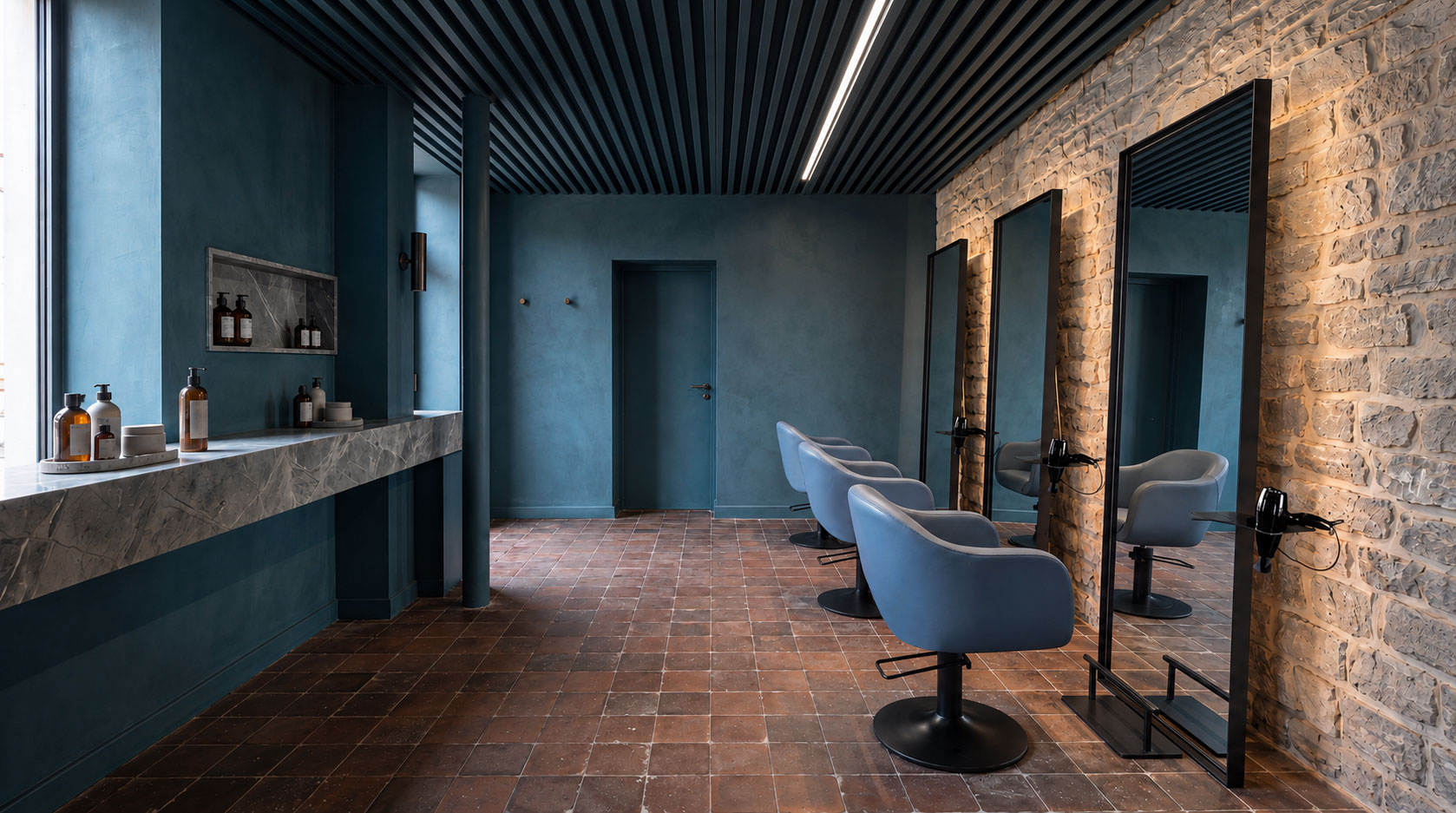
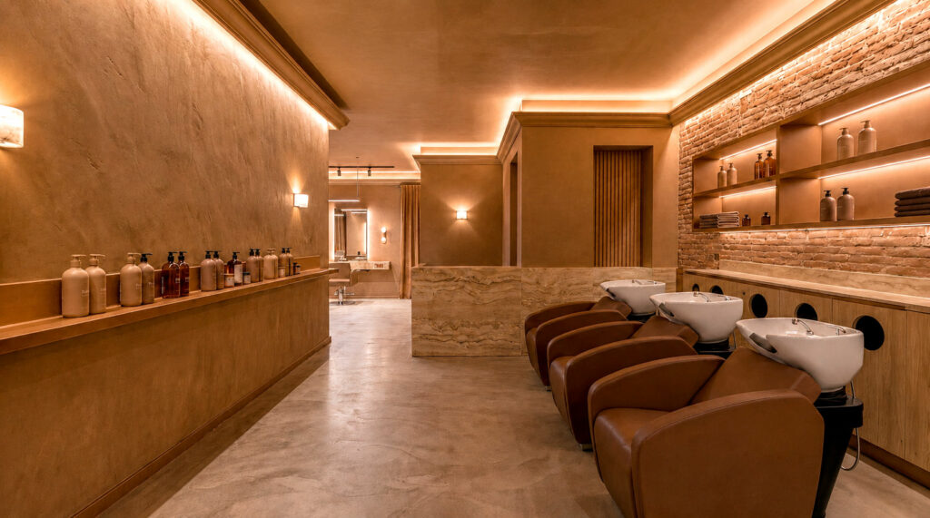
The term Color Drenching, literally meaning “immersion in color,” refers to a design approach based on the use of the same shade, or variations of the same color, across multiple surfaces within a space.
Walls, ceilings, doors, frames, trims, and skirting boards are treated as a single visual composition, sometimes extending the concept to furniture and other interior elements.
The result is a space where the traditional visual breaks between different surfaces become less pronounced, allowing color to act as a common thread throughout the entire environment.
Compared with the more traditional accent wall, where one wall is highlighted through color contrast to create a focal point, Color Drenching follows the opposite direction: instead of drawing attention to a single surface, it creates continuity and immersion.
There are two main interpretations:
In contemporary salon design, color is no longer simply something to choose and coordinate with furniture. It has become a genuine design tool, on the same level as spatial planning, lighting, and material selection.
When used strategically, it can help to:
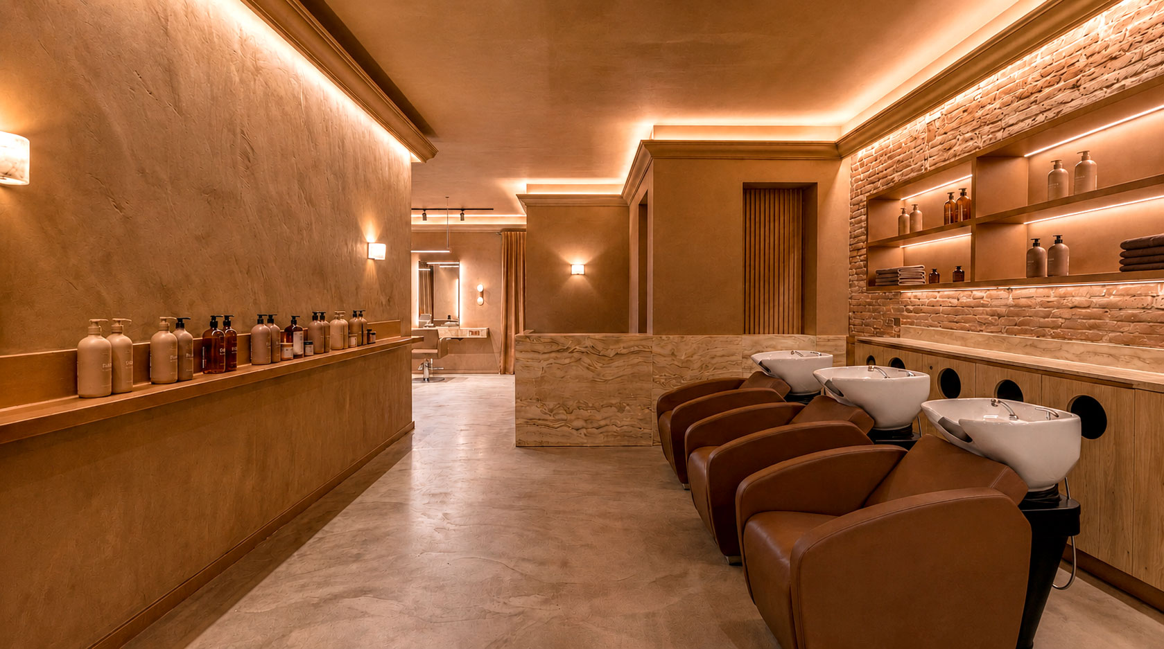
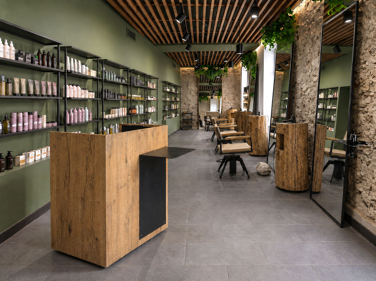
For beauty spaces, the possibilities are virtually endless. Terracotta and brick tones, sage and forest green, burgundy and plum, powder pink, deep blues, as well as warm neutrals such as greige and taupe: the choice depends on the identity you want to create and on how color interacts with lighting, materials, and furnishings.
When color differences are reduced, materiality is what gives the space depth.
In an environment dominated by a single color palette, visual variety comes from the way different surfaces respond to light: matte and glossy, smooth and rough, solid and transparent, surfaces that absorb light and others that reflect it.
This is where materials and textures take center stage.
Natural stones, such as travertine, marble, and onyx, introduce unique veining and irregularities. Woods such as oak and walnut add warmth through their natural grain. Materials such as brass and bronze can create subtle points of light, while textured wall finishes, ceramics, and fabrics contribute to a richer and more sensory environment.
The result is not simply a monochromatic space, but an environment where the same color takes on different nuances depending on the surface to which it is applied.
This approach also shares principles with biophilic design, where natural materials, textures, and nature-inspired colors contribute to a greater sense of balance and well-being.
This is particularly relevant for a salon: customers do not simply enter the space, they spend time in it. Comfort, perception, and atmosphere therefore become an integral part of the service itself.
It is precisely through the interaction between color, materials, and furniture that Color Drenching can evolve from a trend into a genuine design tool.
In a BeautyStar project, the colors of the environment can interact with the shapes, finishes, and materials of the furnishings, creating compositions in which every element contributes to the overall identity of the space.
For example, a warm, neutral palette can be enhanced by wood-effect surfaces and tactile details, while deeper shades can be balanced through refined finishes, satin surfaces, or furniture with clean, essential forms.
The aim is not to create an environment where “everything is the same color,” but to build visual continuity in which color and materiality work together.
Color and materiality are currently two of the most interesting tools for shaping the identity of a hair salon or beauty center.
Following trends does not necessarily mean replicating an aesthetic that has already been seen elsewhere. It means understanding how those trends can be interpreted to develop a personal project that is consistent with the brand and with the experience you want to offer.
Because a well-designed salon does not communicate only through its logo or through what happens in front of the mirror. It communicates through every surface, every color, every material, and every detail.
And when all these elements speak the same language, the space itself becomes part of the brand identity.
Would you like to design your salon according to the latest interior design trends?
The BeautyStar team is available to work with you on a customized project, developed around the characteristics of your space and the identity you want to create.